Do you know the rule of three?
In design, using threes helps you build interest and drama, as well as harmony, and it a very effective way to create visual movement in a room . Three works for function e.g., kitchen work triangle, furniture arrangement, sofa and two chairs. It also is frequently used for colour and fabric schemes and groupings of accessories and vignettes. Three can effectively establish a focal point. Here's how you can liven up your space and help improve function.
This is a wonderful graphic produced by Adi Edlin that shows the rule of 3 working twice in a vignette. First in the grouping of accessories in sections and then in the overall design of the vignette.
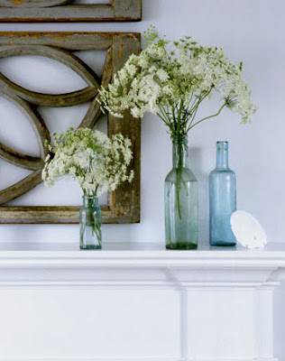
A simpler version of the rule of three where you have three bottles mixed with three other objects (2 bunches of flowers and a shell ).
Art collections always look great in groupings of 3. This one is perfect because it totally fits the wall space and is in keeping with the graphic nature of the colour scheme. I also love the visual relief the circle provides for all the straight lines. Circles in a grouping also move the eye effortlessly. They are great pivots.
VT Interiors
This dramatic space is further enhanced by the inclusion of the three arched mirrors which provide a focal point ( not an easy task in this space). Relief from the straight lines in the rest of the room is also provided by the curves.
Do you see three in this arrangement? Often you get furniture with very distinct divisions as in this settee. Because it visually reads as two with the centre legs it provides the perfect foil for this artwork.
Look carefully at this vignette because it is masterfully put together in variety and scale . First we have two windows and a mirror mimicking the windows for a total of 3, then there are three hats visible in the mirror and three objects in the vignette (bench, floral arrangement and mirror). The scale of the bench is perfect for the width of the 3 "windows' behind it and the flower arrangement works so well with the weighty bench.
Lots of threes here: colour scheme of yellow, blue and gray; vignette of art, chair and table; and three shelves and three groupings of objects on each shelf. There are also at least three yellow and blue objects spread throughout the vignette to move the colours around.
Perhaps you can look around your home and see places where the rule of three can be put to use to refine how you have arranged things. Don't overdo it ! Remember that any odd number is effective. I particularly love five mixed with three. Have fun.....


